WRAITH COUNTY
Embrace the Shadows.
The County Calls.
Wraith County are a streetwear brand creating a new language of fashion. They believe in the beauty found in the most overlooked and derelict of places - the diamonds in the dirt. With a focus on providing meaning and stories within their collections, Wraith County aim to become a virtual personification of their ideas and an underground fashion cult for outsiders to belong.
PROJECT BREAKDOWN
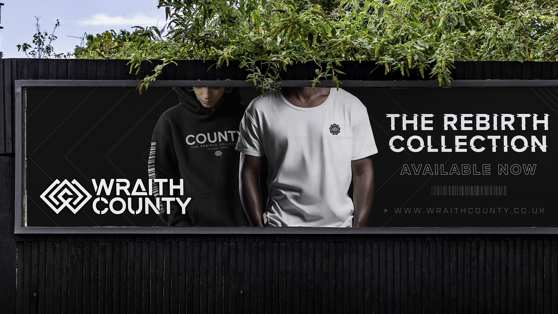
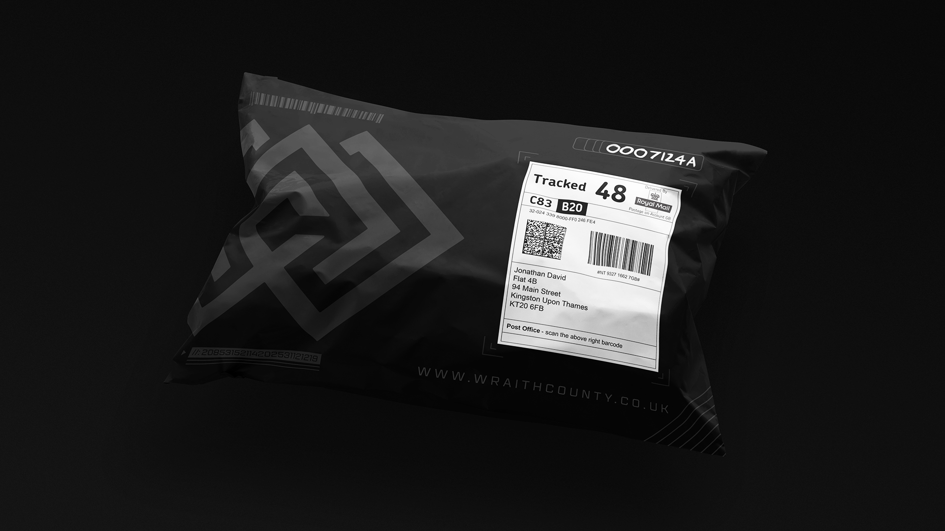
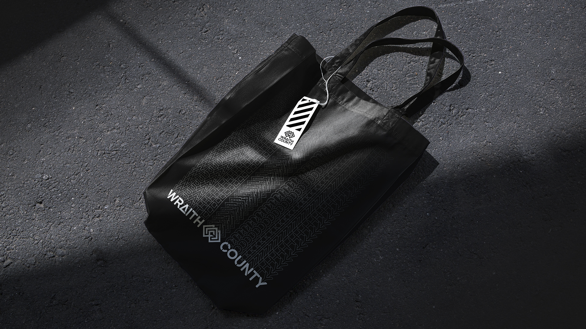
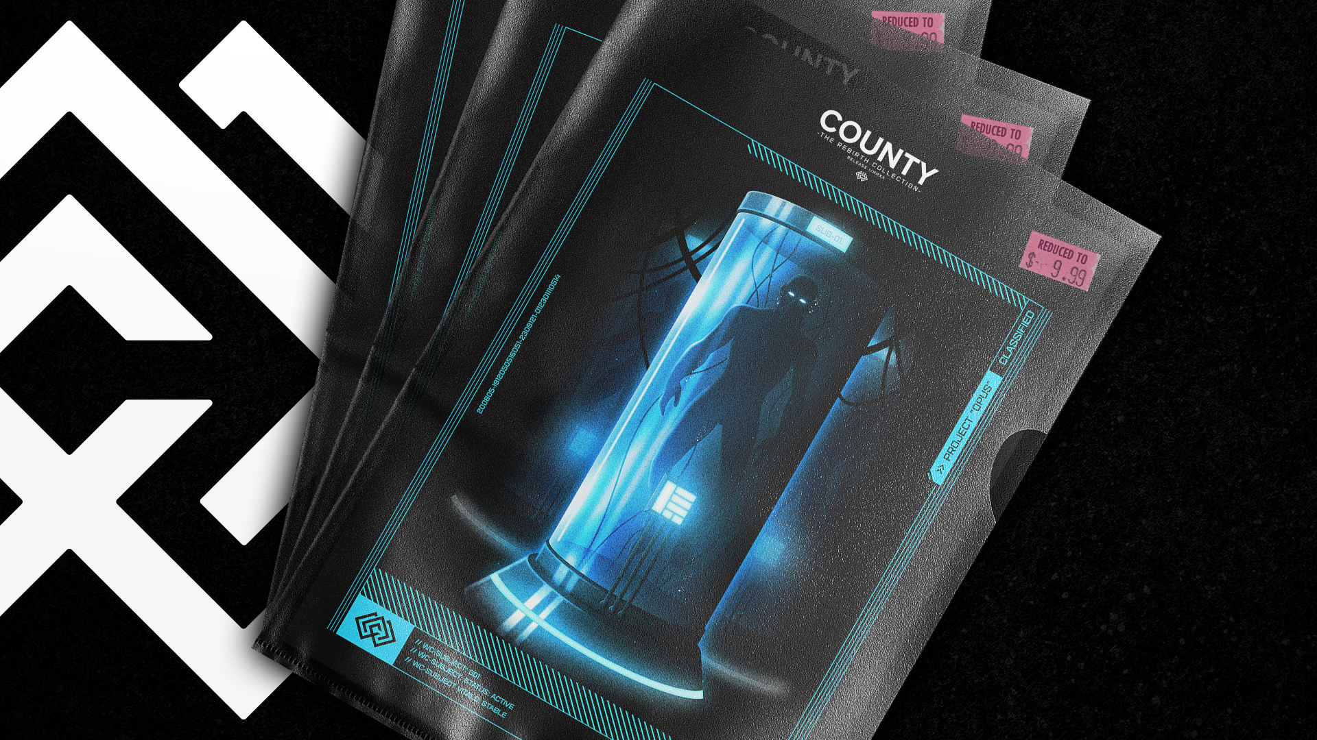
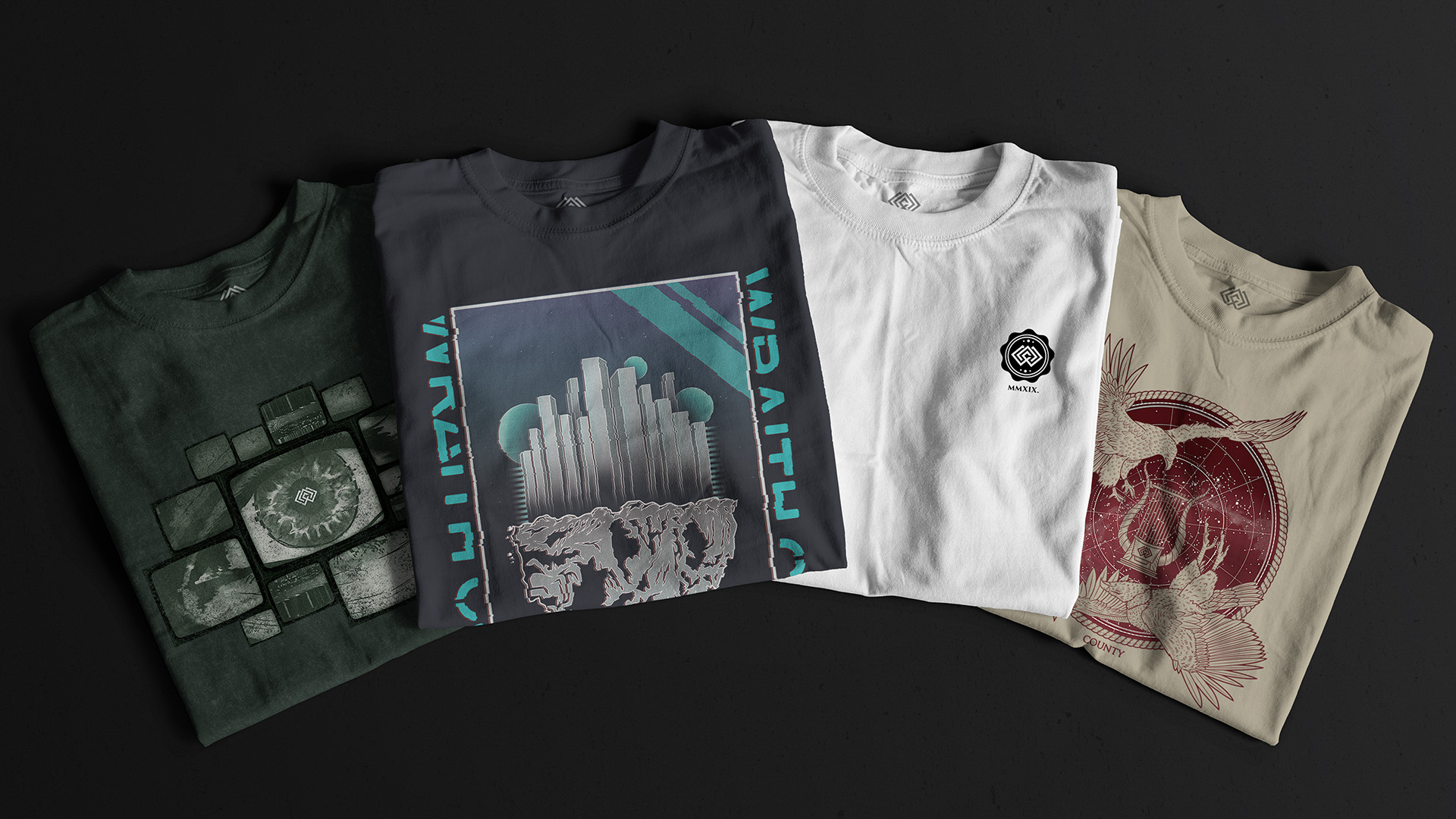
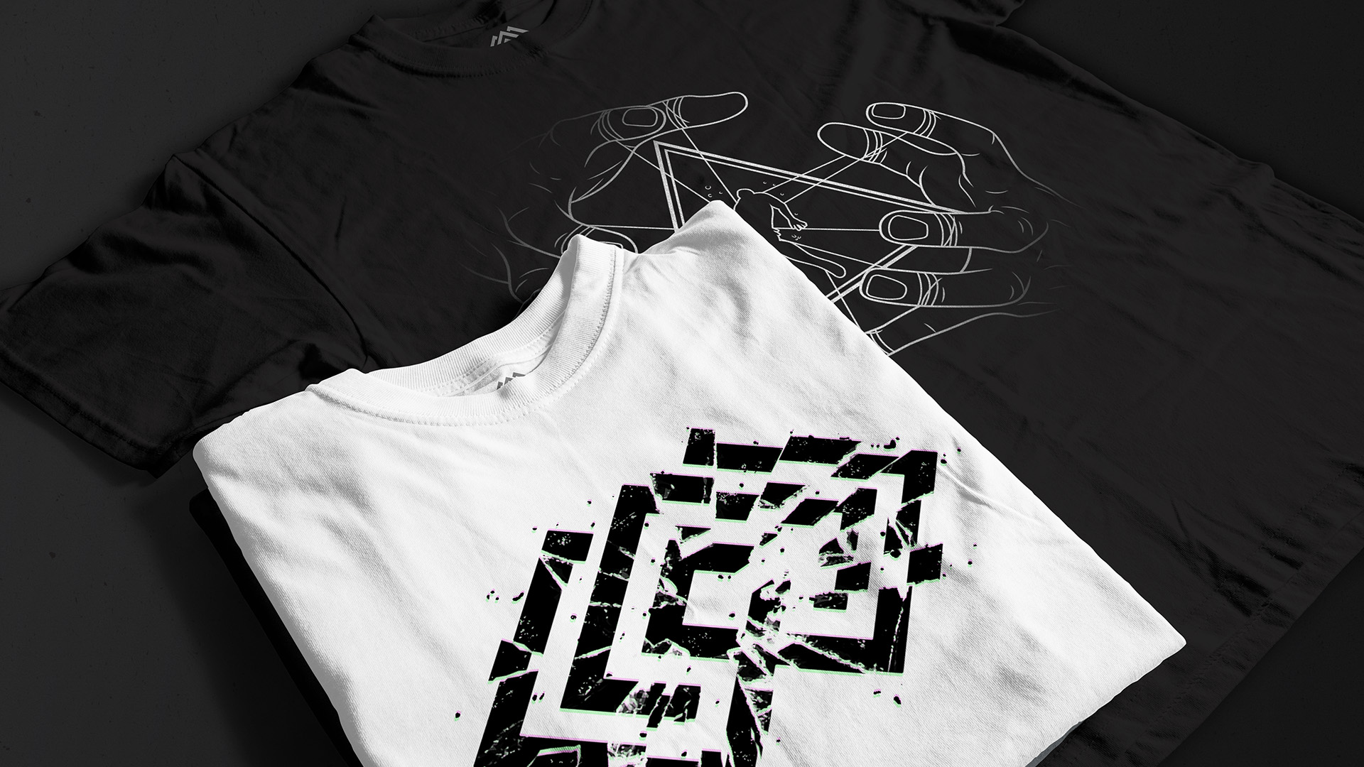
Wraith County required creative support building out and launching their brand. Established as a new business to encompass their original ideas, Wraith County aimed to explore new territory separate from their sister brands. My role in the collaboration oversaw work completed on their brand strategy before creating their new core brand identity. Other work included the creation of company collateral, designs for their launch collection and the packaging/promotional materials needed to go to market.
Project Services:
- Brand Strategy
- Brand Design
- Brand Experience
CREATIVE INSIGHT
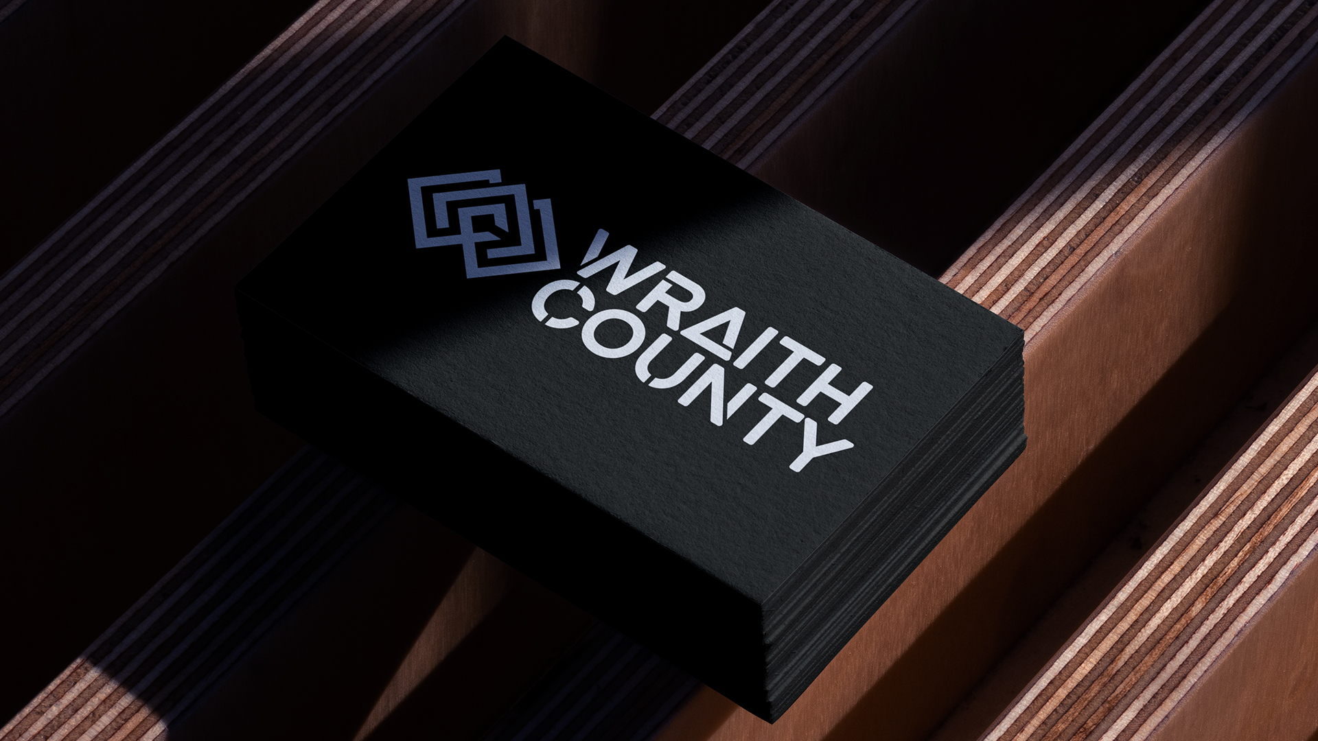
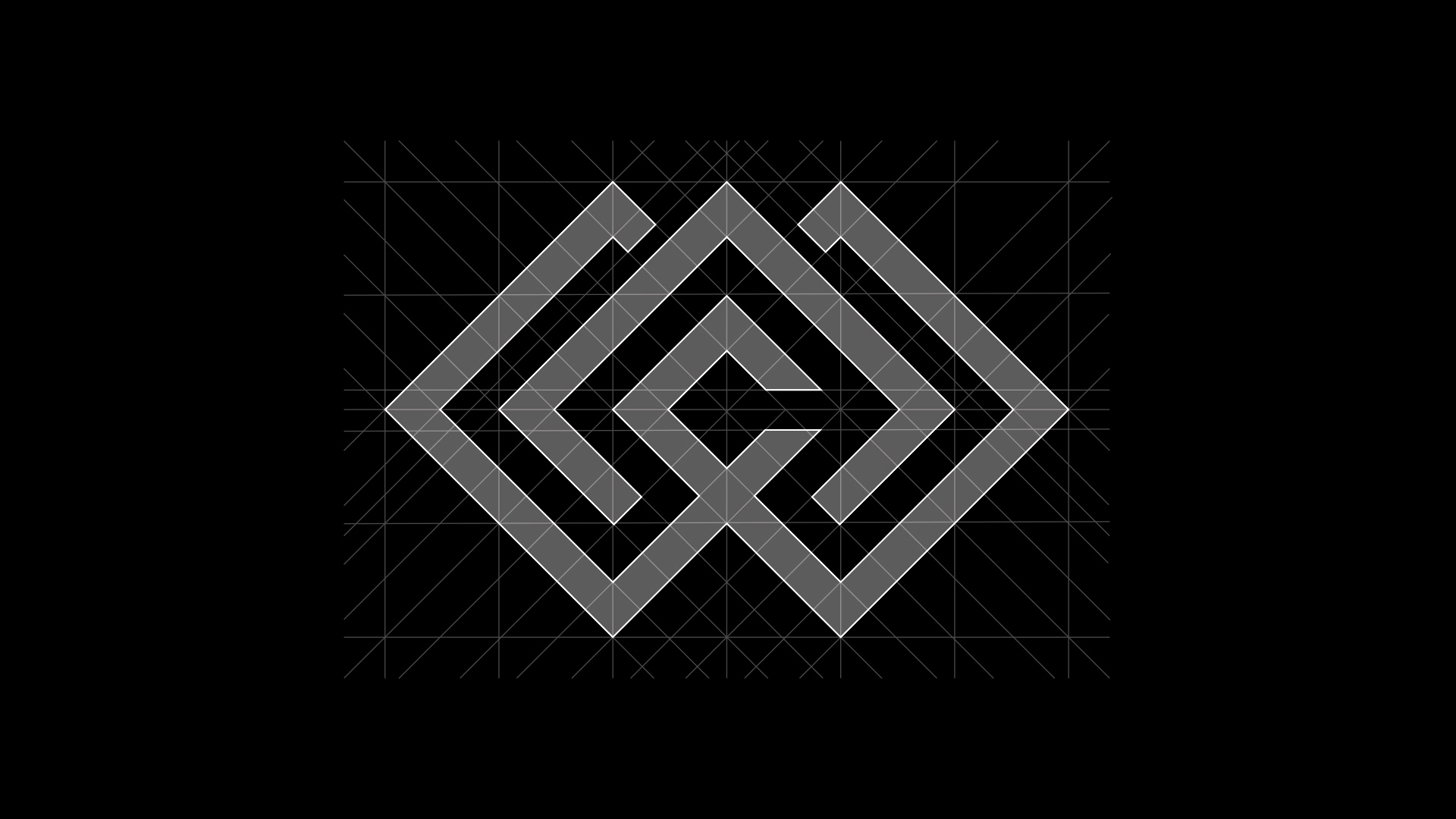
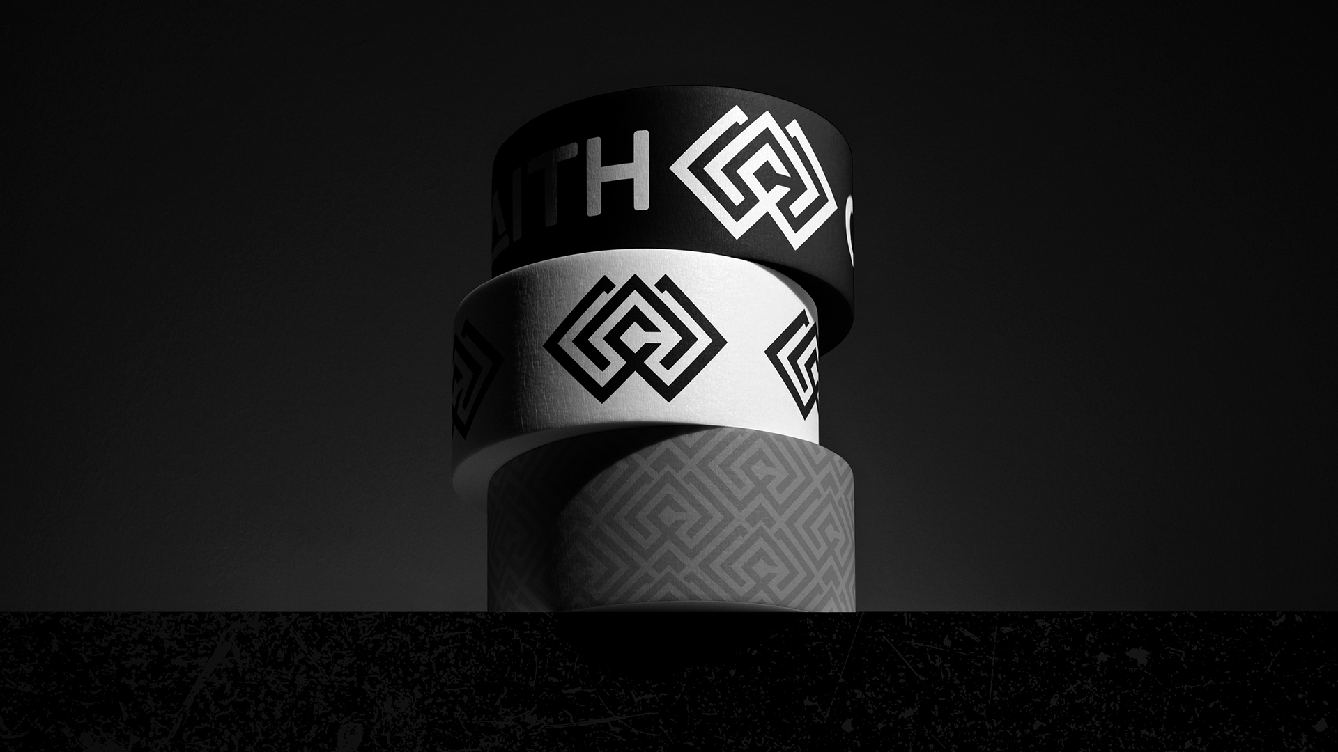
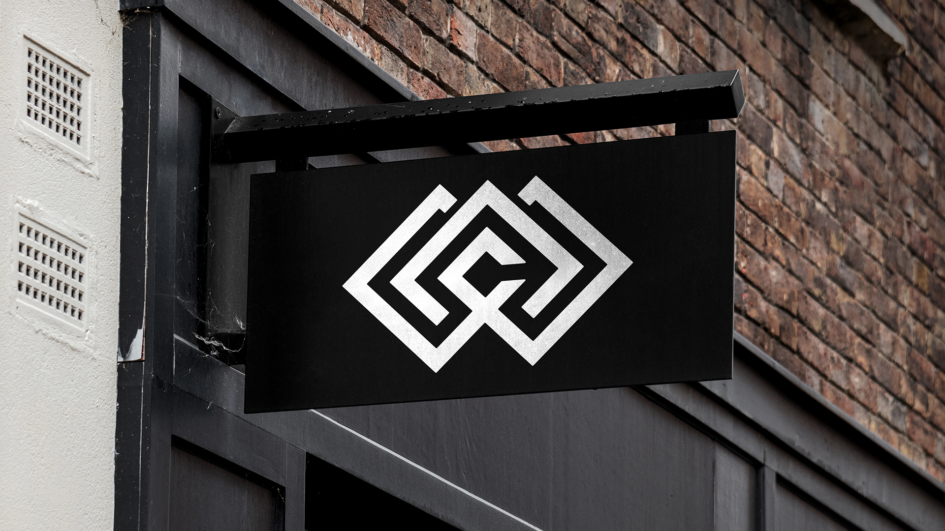
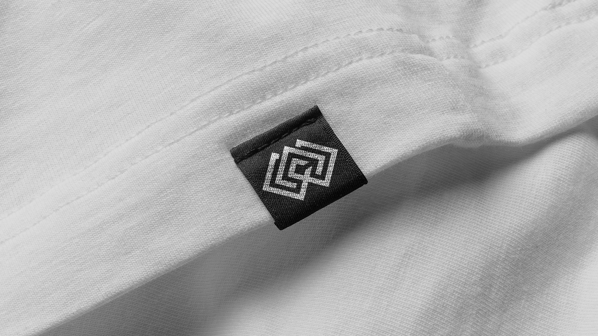
Wraith County needed an iconic, standout identity to represent their bespoke voice within the overcrowded fashion space. Their logo needed to be able to fit seamlessly into their brand ideas while also encompassing a ‘street’ vibe and maintaining a premium edge. After defining their strategy, we explored different paths of thought to find a direction to build their foundations from and found that we kept revisiting ideas rooted in a bold, black and white aesthetic that felt as if it fit their brand story perfectly. To find their logo, we then took the same approach with story being the main driving source. The goal was to find an inventive solution that combined the initials of the company in some way while also having an aura that emitted an underground movement undertone. The proposed approach that eventually became the final direction was to combine concealed initials with this idea of a ‘big brother-esque’ all seeing eye to fit within the themes and communicate the foundational ideas behind the brand perfectly. This was then combined with a bespoke wordmark to create an impactful and versatile logo suite ready to be used across the rest of their assets as we developed further designs for their collections, marketing, packaging and other media.
EXPLORE MORE PROJECTS
BACK TO ALL PROJECTS
You've seen the work, you know the process, and you understand the approach. If you're ready to build a brand that truly stands out, I'd love to hear from you.
LET’S GET STARTED