RGB VS CMYK: WHAT'S THE DIFFERENCE AND WHEN TO USE THEM
If you’ve ever worked with graphic design, photography, or branding, you’ve likely come across the terms RGB and CMYK. While they both relate to colour profiles, they serve very different purposes and understanding their differences is absolutely essential if you want your designs to look great both on screen and in print. So let’s break it down simply.
What Is RGB?
RGB stands for Red, Green, Blue. It’s the colour space used for digital screens. Think computer monitors, smartphones, TVs, tablets, and any other device that emits light. In the RGB colour model, these three colours of light are combined in various ways to produce a broader spectrum of colours. When all three are at full intensity, the result is white; when all are at zero, the result is black (the absence of light).
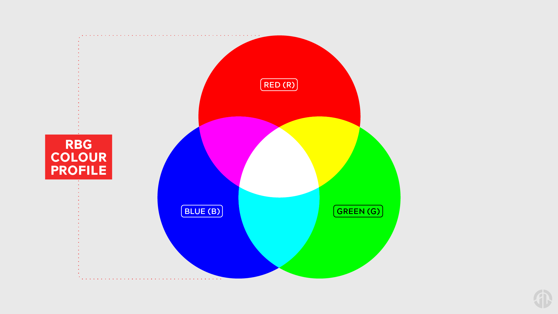
Seeing as RGB is an additive colour model (a model that functions on adding colours until you get to pure white), you can expect RGB to display more vibrant and luminous colours, especially when it comes to bright blues and greens. You should be using the RGB colour model for:
- Web Design
- Social Media Graphics
- Digital Advertising
- Email Assets
- App Interfaces
- and any other image or design that is meant to be viewed on a screen.
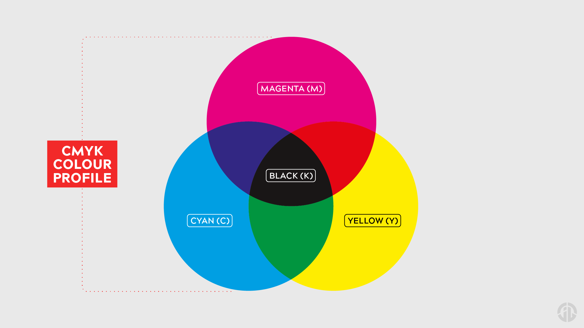
What Is CMYK?
CMYK stands for Cyan, Magenta, Yellow, and Key (Black). This is the colour space used for print design. Think posters, flyers, packaging and any other tangible material.
Unlike the additive RGB colour model, CMYK is a subtractive colour model, meaning that it instead works by subtracting light from pure white. As inks are layered on paper, they absorb light and reflect specific wavelengths, producing what our eye perceives as colour. By combining all four colours in the CMYK model, we can produce rich blacks and a full spectrum of printed hues.
CMYK is more limited in colour range than RGB, so what looks bright and vivid on your screen may appear much duller when printed, especially neon colours or highly saturated tones. You should be using the CMYK colour model for:
- Brochures
- Business Cards
- Flyers and Leaflets
- Packaging
- Posters and Signage
- Magazines and Books
- and any other material that requires a printing process.
RGB vs CMYK in Practice: Why It Matters
Choosing the wrong colour profile can lead to unexpected results and can sometimes ruin the assets you’re creating. It can potentially have detrimental effects on digital advertising campaigns or can result in having to undergo printing reruns which can be very costly. It’s worth noting that:
- If you design in RGB but print in CMYK, your colours will look washed out and will be drastically different.
- If you design digital graphics in CMYK for RGB devices, they may not display correctly and will have a less vibrant appearance (and can be unnecessarily large in size!).
It’s always worth remembering to set your colour mode at the beginning of every project based on your intended final output for the asset(s) in question. If it’s going online or digital, use RGB. If it’s going to print, switch to CMYK.
So, In Summary…
Whether you’re a designer, marketer, a business owner, or even just a hobbyist exploring a new passion, knowing when to use RGB vs CMYK will help you to maintain colour accuracy, colour consistency and most importantly, professional-quality results with your colours. It’s a small detail with a big impact - especially when it comes to translating visuals across platforms. Don’t let your designs fall flat, be sure to choose the right colour profile from the start now you know!